 The goal of Phrenicea's founders was to create a striking identity for
Phrenicea.
No generic or "Brand X" thinking here!
They were optimistic that it would come to represent riveting change for the entire world — the 21st-century's most influential and eventually best known brand. Seeking that elusive quality that world class brands possess did not come easily however. The design of the Phrenicea logo went through many iterations. Various marketing agencies were secured through the years, and the drastic changes in direction reflect the uncertainty with regard to the how to present an image for Phrenicea. The following shows the struggle to reach Phrenicea's final identity, which by mid-21st century conveys its comfortable and mature place in our world's future.
This first attempt to create a timeless image for Phrenicea makes use of the already tired "infinity" graphic. It was a flop and was replaced within just two years.
This concept presented a circle and a line. The circle was supposed to suggest the collective consciousness aspect of Phrenicea. The marketing agency touted, "This design has a futuristic feel yet includes ancient and simple icons." It was questionable whether the general population interpreted that much from the design.
The same marketing firm that produced the original Thought Circle was fulfilling their contractual agreement by sprucing up their first concept. This was touted as more ambitious with more emphasis on the word Phrenicea. Again, would anyone get it?
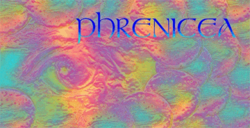
A newly hired marketing firm completely changed direction with something from the psychedelic 1960s! What were they thinking? The firm's description of the new identity: "The use of the eye represents a window to the mind. The circular objects may resemble a galaxy. The image as a whole is quite colorful and is intended to represent the future." What were they smoking? (They were quickly fired.)
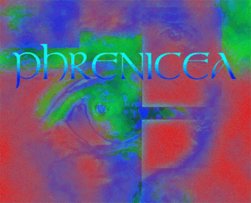
The third marketing firm unbelievably wanted to build upon the previous firm's effort. Their concern was that each logo iteration was obliterating whatever identity might have been garnered, since there was absolutely no continuity. They therefore recommended keeping the eye theme. Intellectually it's a sound approach, but that color!
It became obvious that the red color was a big mistake. There were many red-eye themed jokes which did help awareness, but certainly did not gain the respect that was thought crucial to enabling Phrenicea to fulfill its mission to fully integrate with each individual's mind. With this iteration it became apparent that they finally got it right. The logo was warmly and universally accepted to represent the capabilities of Phrenicea.
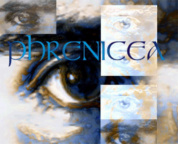
The same marketing firm could not help themselves when they volunteered this second contrasting
concept to The Mind's Eye above. Their spiel: "The Eye's Mind is suggestive of the brain
or mind but is non-specific. The d
The Eye's Mind and The Mind's Eye served Phrenicea well and were used for many years. Although there was no intention of replacing them, a simple and elegant representation of Phrenicea was desired. As Phrenicea gained world-wide acceptance, there was less of a need to force itself upon the masses with bold logo identities. The simple elegance of this final version would take Phrenicea well past the turn of the 21st century.
The evolution of the Phrenicea logo reflects Phrenicea's history in society — from a brash newcomer with then-unbelievable aspirations to a respected entity with universal acceptance and usage after just several decades. The Future — It's All In Your Head! ®
This page belongs to
Entire site ©2000-2014 John Herman. All rights reserved. |


